Olivia Lux
Branding | 2020
Olivia Lux is a drag queen from Brooklyn, New York, and was be featured on season 13 of RuPaul's Drag Race.
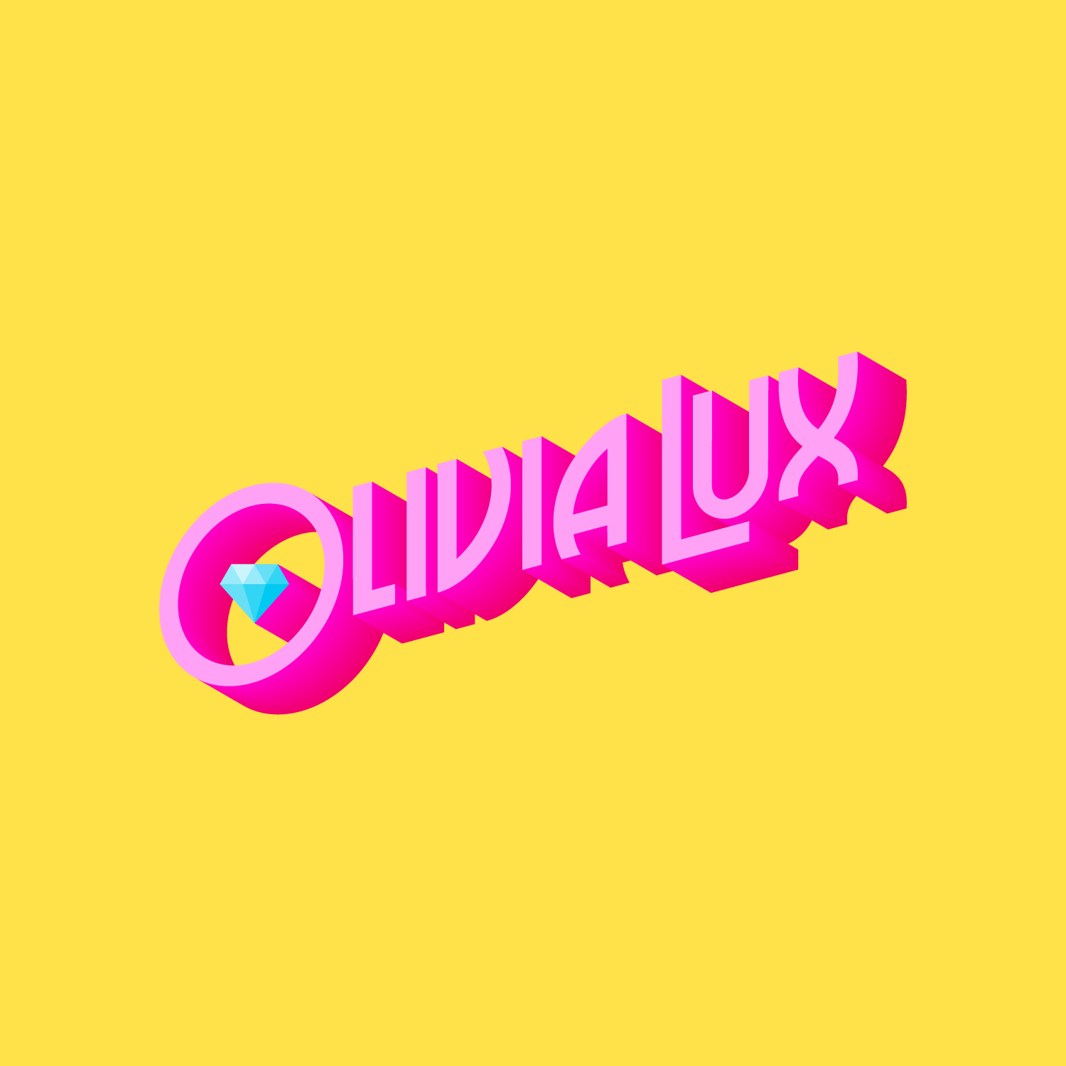
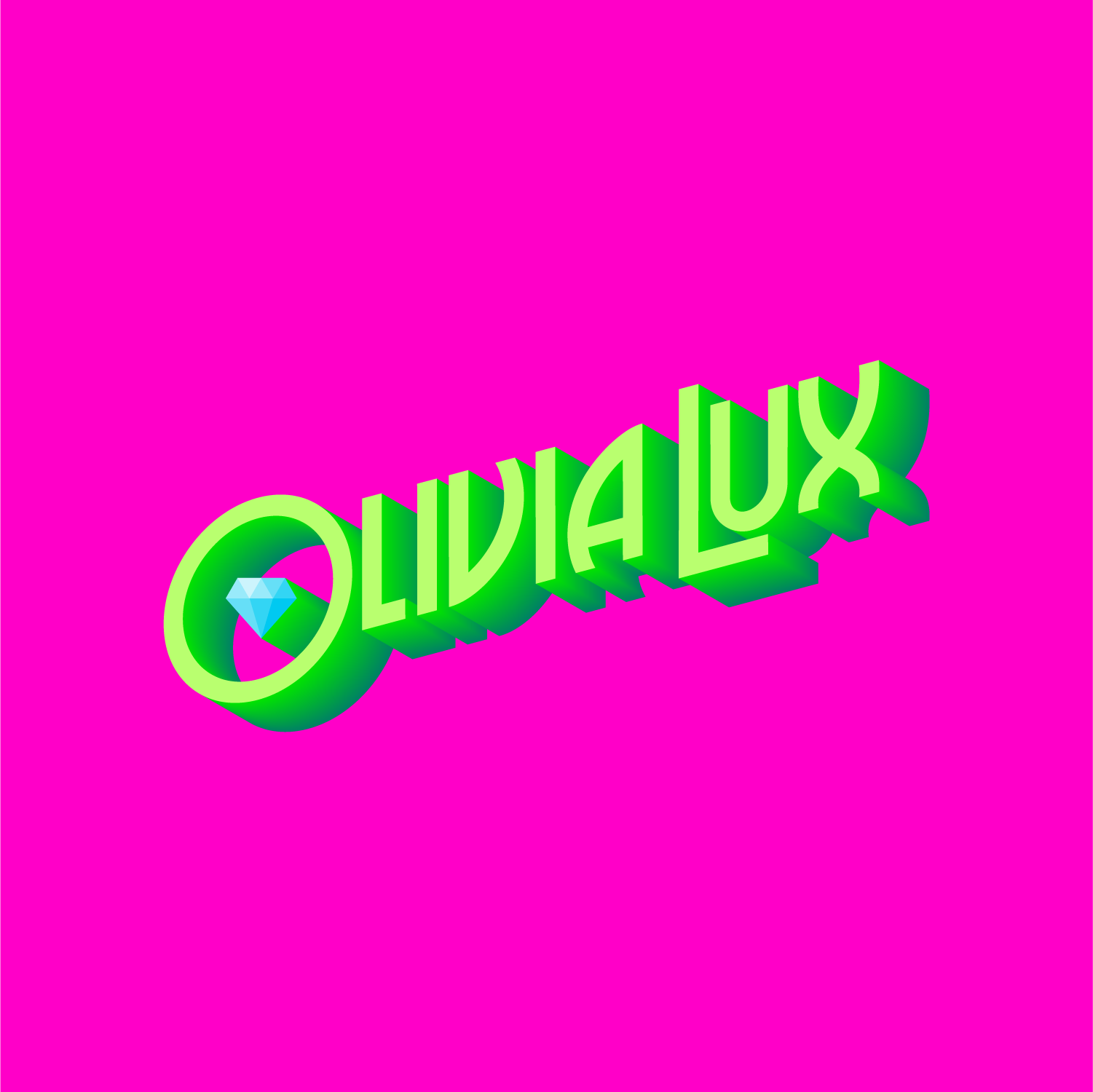
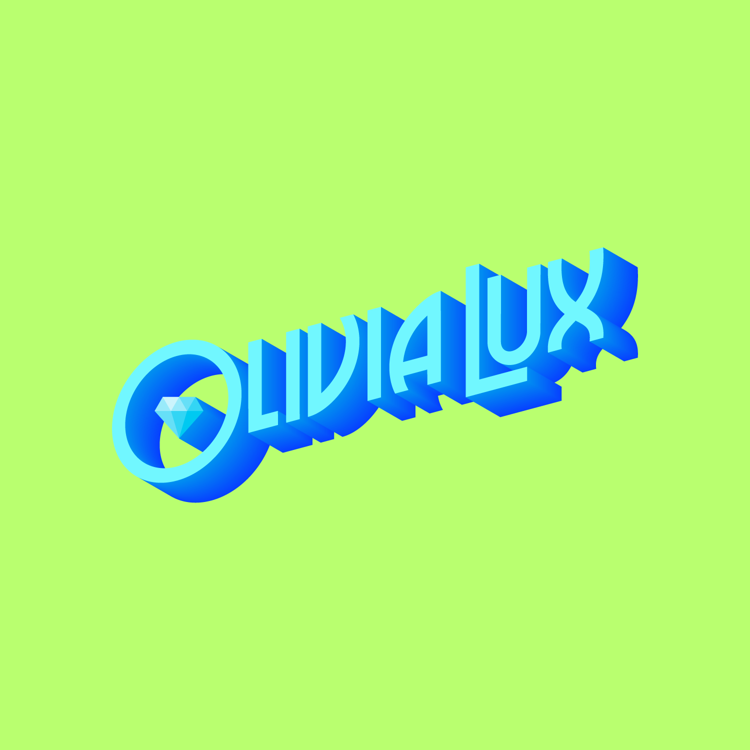
When she approached me to brand her drag persona, I was beyond excited to work on such a big part of queer culture. In our discussions, she wanted something that was evocative of the golden age of Hollywood, but done through a lens of modern drag. I created a logotype that is vibrant and a little bit funky, and built the base of a brand with room to grow and expand as this queen's star rises.
Primary logo lockup and color scheme
After going through multiple color schemes with various levels of complexity, we settled on four main colors that could be used in different combinations. The Bright Like A Diamond blue is the connecting thread through all of the logo colors.

Two alternate logos were developed from the main logo; both are shortened versions of the queen's full name. Liv will primarily be used for square applications, and LivLux will be primarily used on social media and branded swag.
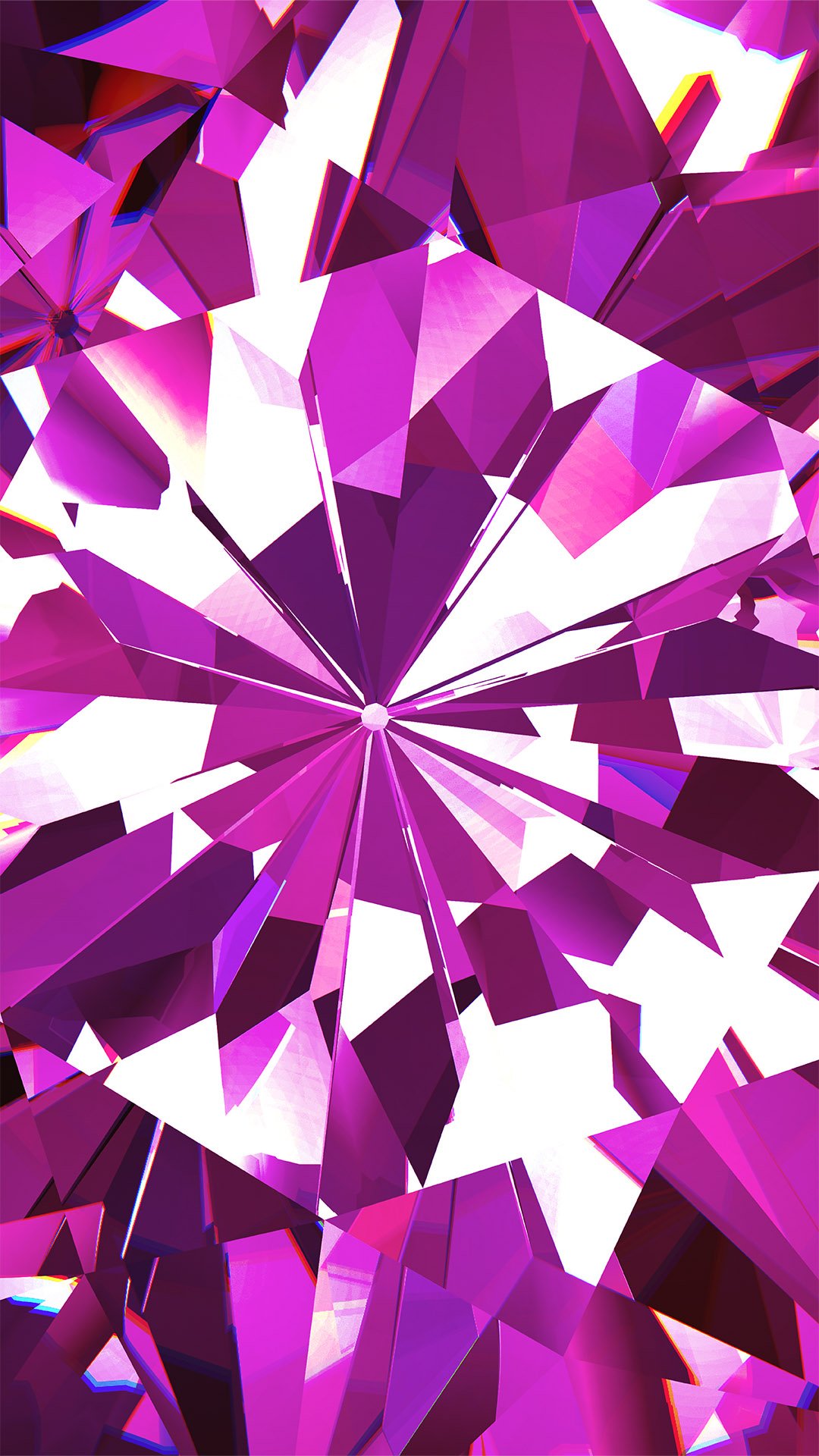
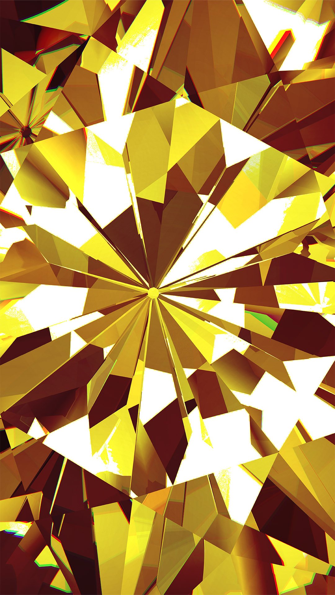
Continuing the diamond motif, we developed these colorized diamond patterns to be used across social media channels, branded swag, and promotional materials, in conjunction with solid colors and other brand elements.


