SEI Veridium
Brand Development | 2020
This project was challenging but immensely rewarding—it was my deepest dive yet into UI design, and our biggest freelance client to date.
SEI had developed a finance tracking web app over the last few years, but without much thought into UI & UX. Things were a bit messy, with nested tables within nested tables, no mobile-adaptive view, and no proper navigation or design consistency. The ask was to clean all this up, to propose an entirely new UI & UX, cleaned up navigation, design, and to make it desktop and mobile friendly.
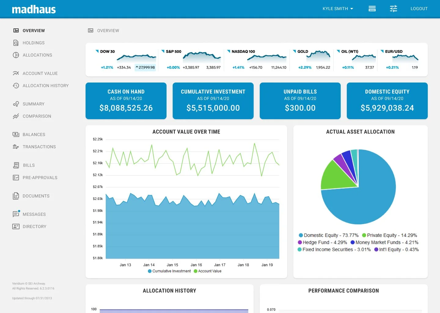
Overview page in light mode
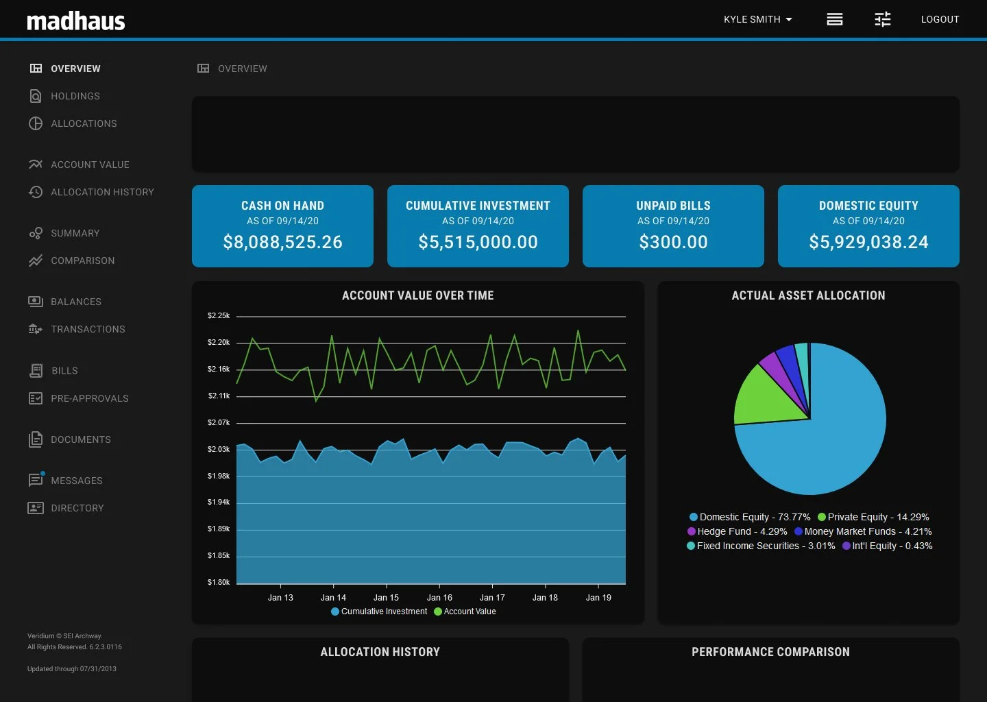
Overview page in dark mode
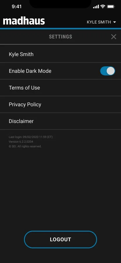
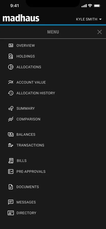
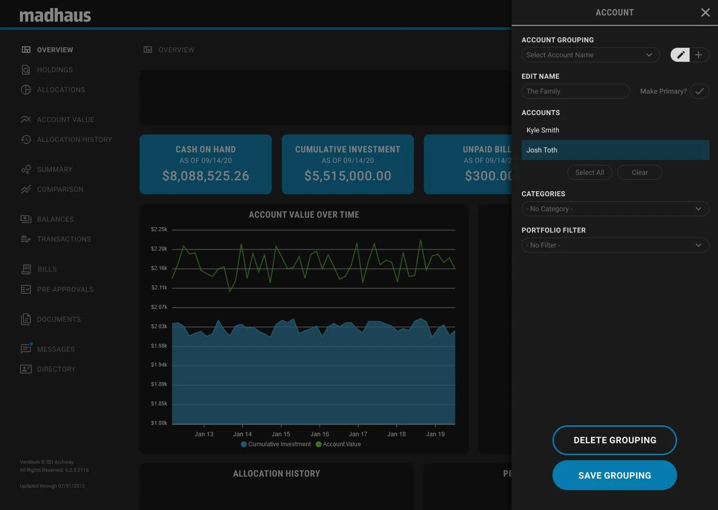
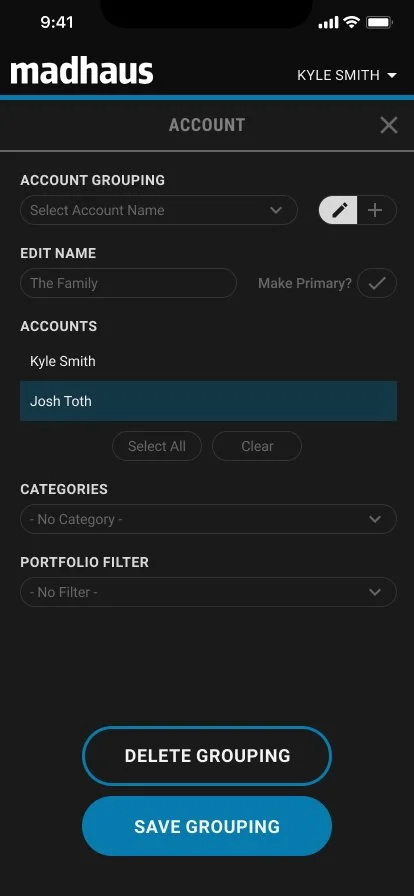
To create the best experience possible for both mobile and desktop users, we developed a series of cards with multiple functions. On desktop, the cards would slide in from the right to serve as a place for settings and additional options. These cards would become full-screen on mobile, keeping the same functionality but requiring some additional mobile-only navigation in the header.
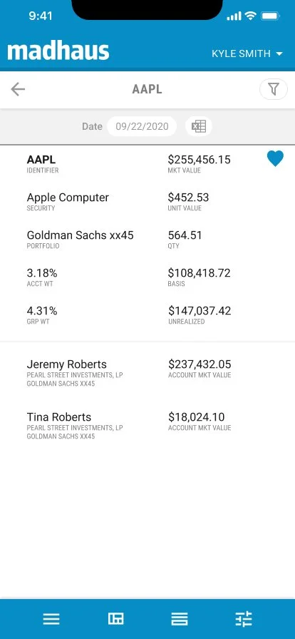
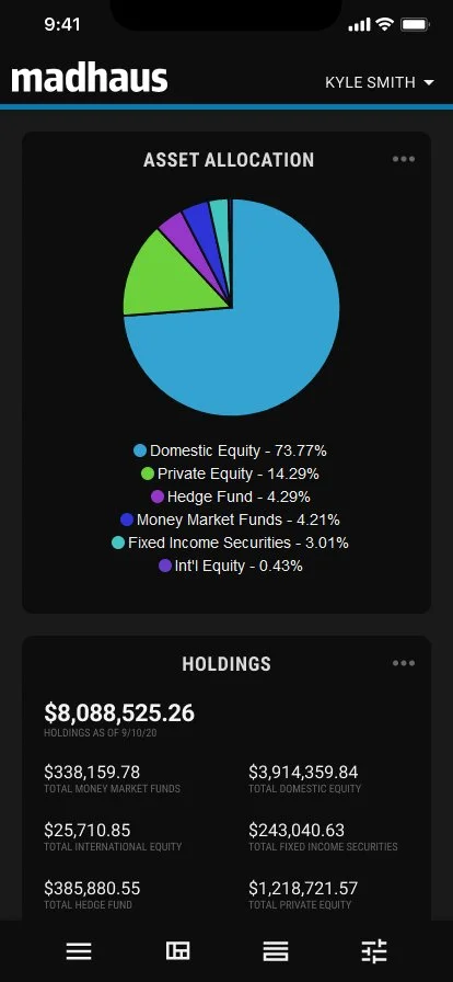
The information on the desktop charts was simplified to fit on a mobile screen, and any additional information was placed on a secondary card screen. This allowed users to skim and drill down into specifics as needed on both screen sizes.
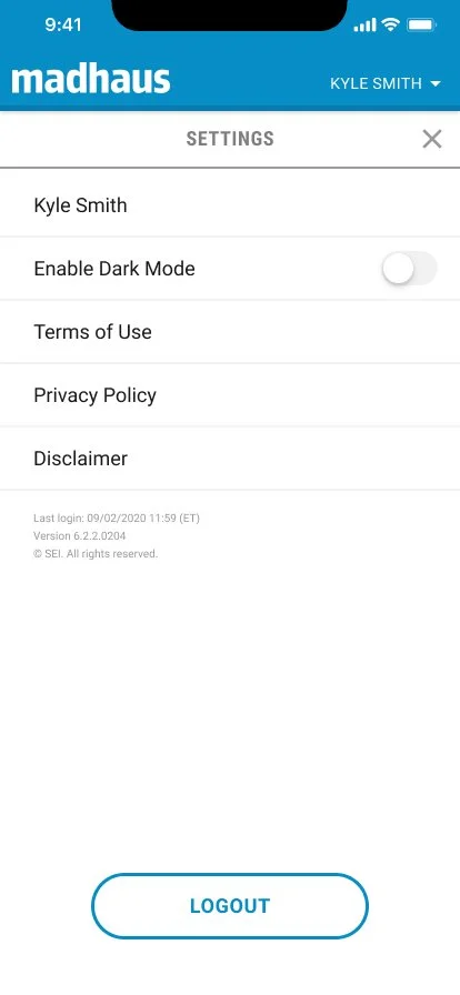
Mobile settings in light mode
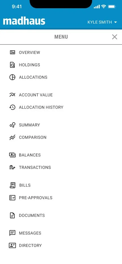
Mobile navigation in light mode
Mobile settings in dark mode
Mobile navigation in dark mode
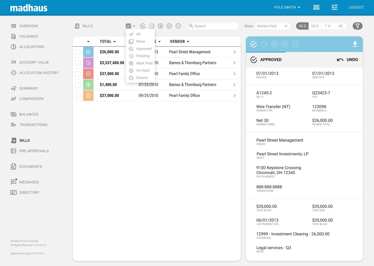
We had to account for a variety of current features, including in-app messaging, an expense/bills approvals process, document organization and uploading, and various charts and viewing tables.
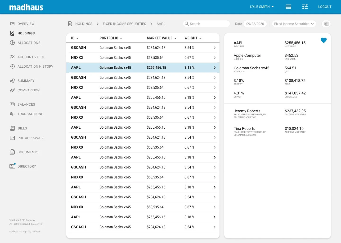
Holdings page with detail toggled, desktop
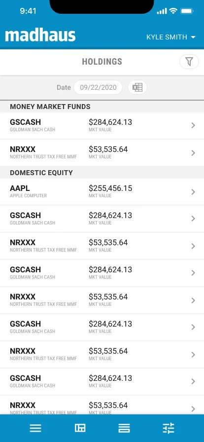
Holdings page, mobile
Holdings detail page, mobile
Account settings menu, desktop
Account settings menu, mobile
Overview page, mobile
Bills overview page, desktop
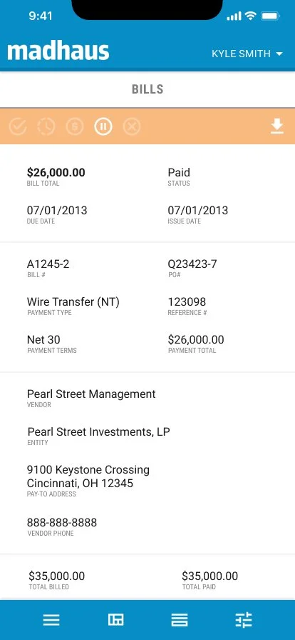
Bills detail page, mobile
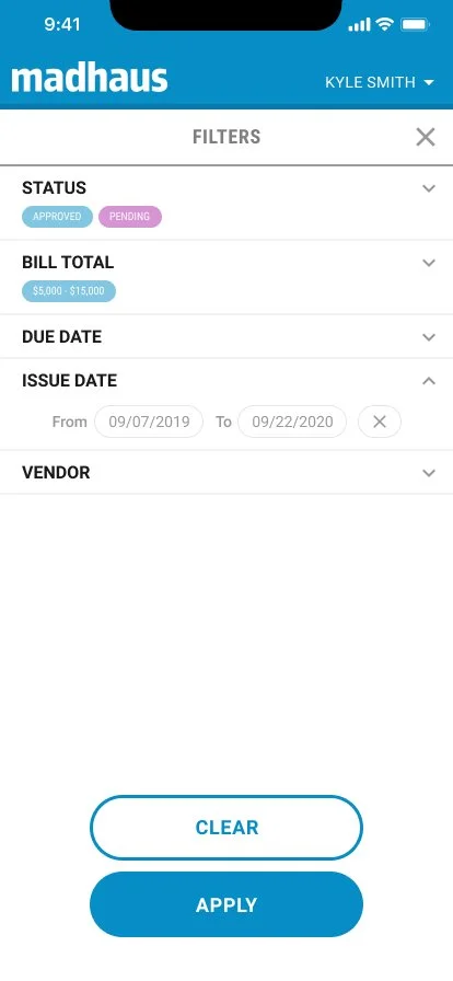
Bills filter settings, mobile
Button states, light mode
Button states, dark mode

