My Weekly Meltdown
Brand Creation | 2020
My Weekly Meltdown is a weekly podcast (broadcast on YouTube and Apple Podcasts) that covers popular reality competitions, with a focus on Big Brother, Survivor, and Sequester. MWM is a rising podcast star in this vibrant fandom, and they wanted a refresh on their identity to help boost their impact and gain followers.
The brief was fairly simple: they wanted a logo that could be bold and attention grabbing, and that could be used for all of their shows. Oh, and it had to include one of the host's iconic flyswatter.
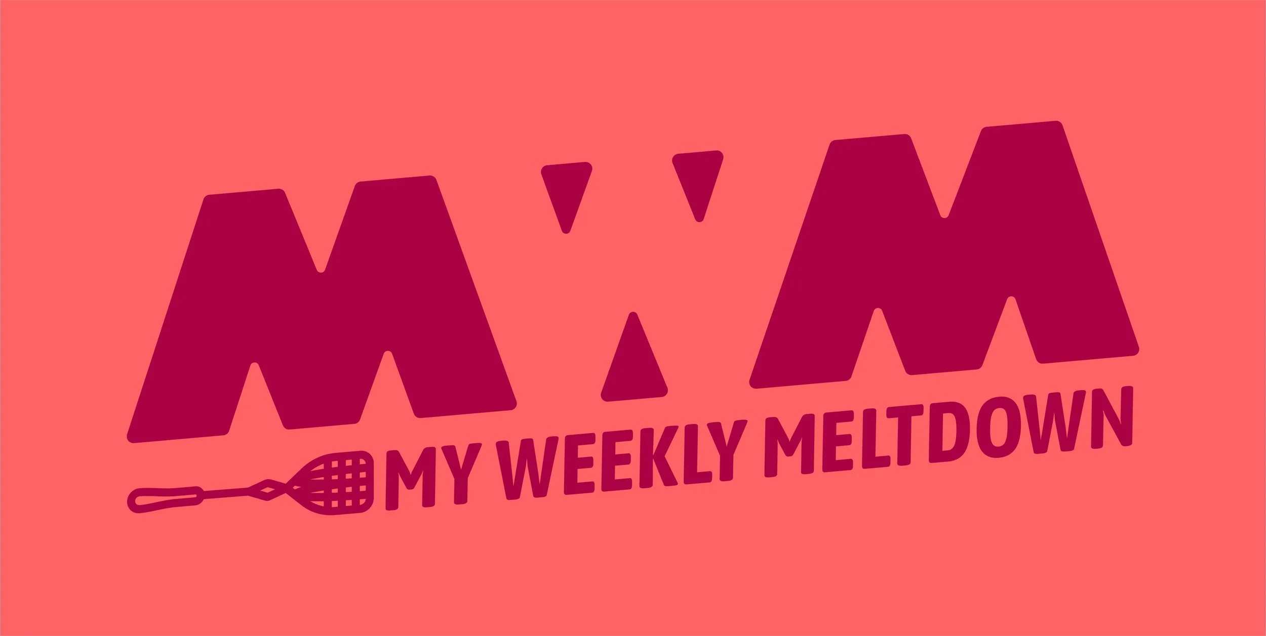
Primary logo lockup and color scheme
The solution was to create a logo that could be versioned for each of the shows the podcasters cover, with room for coverage growth in the future.
Each logo version has a color palette that is vibrant and a little funky. The colors riff off of the main brand colors of the actual reality show being discussed, to subconsciously evoke the shows.


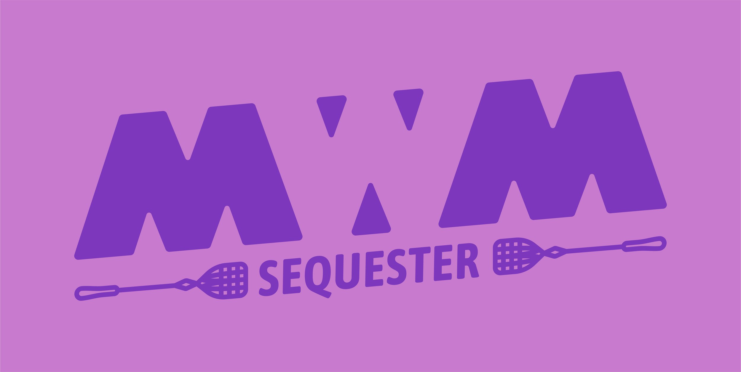
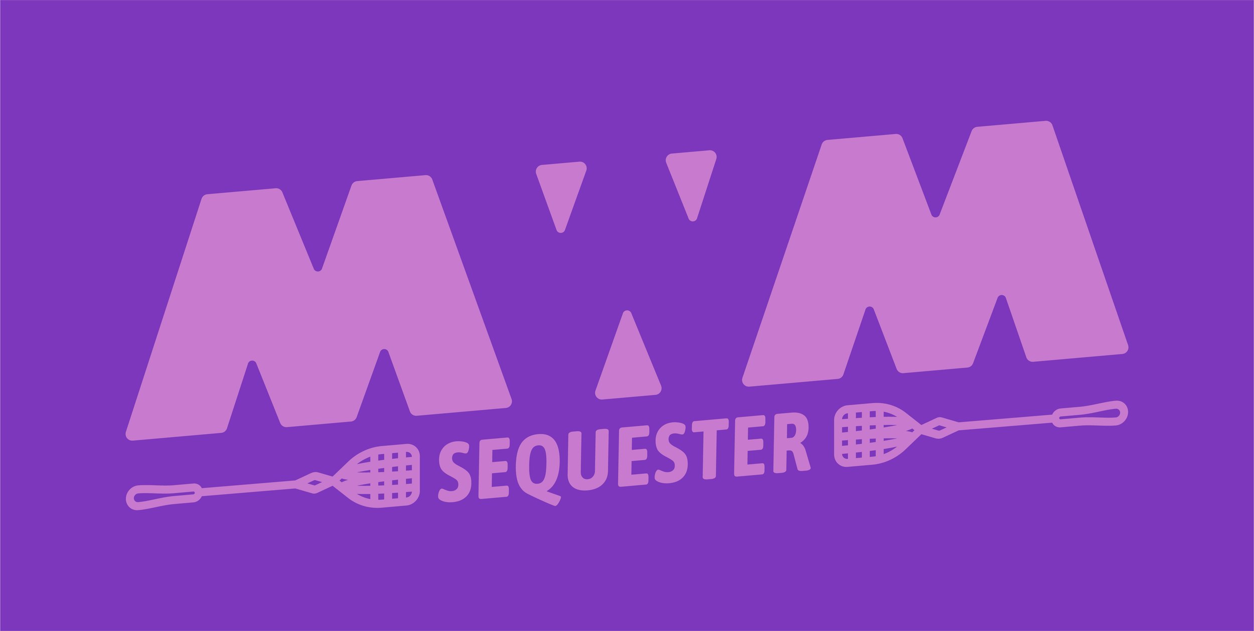
Each of the logos has a pair of colors, a light and a dark, and the logo can be in light on dark, or vice versa.
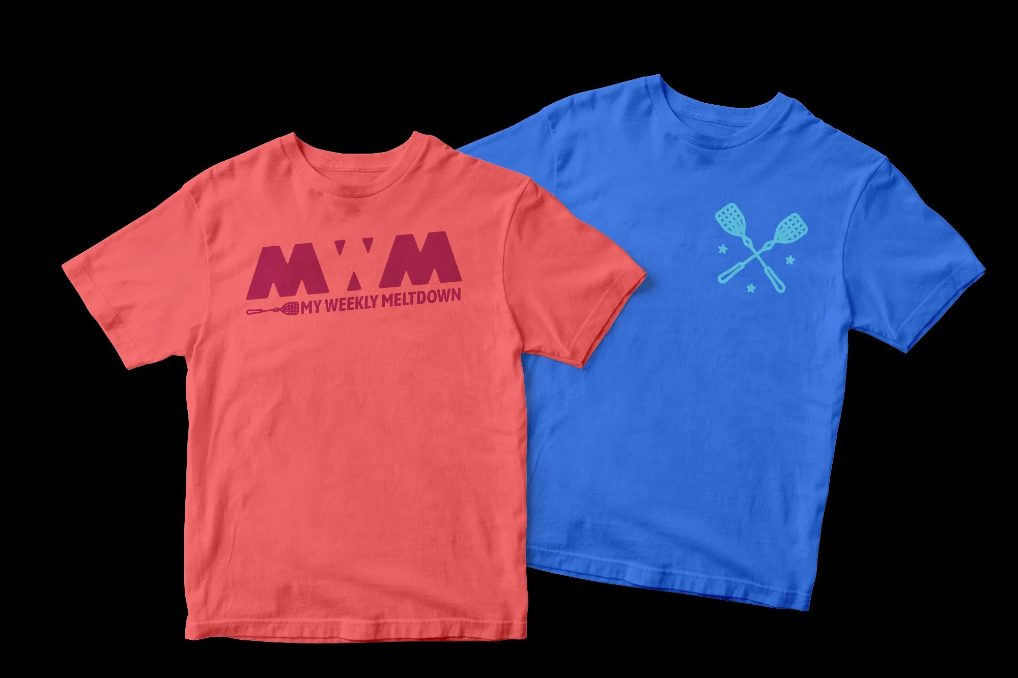
We also created a set of icons to match the logos. The crossed flyswatters represent the quick back and forth and the often combative opinions of this fandom, and the three stars represent the three hosts.


A robust brand book was created for the new system. For example, each logo had four color options: a primary logo with a colored icon and black or white text, and a secondary option that was solid black or white.
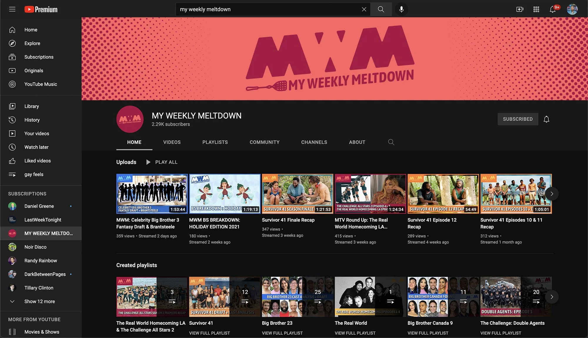
Updated YouTube channel page
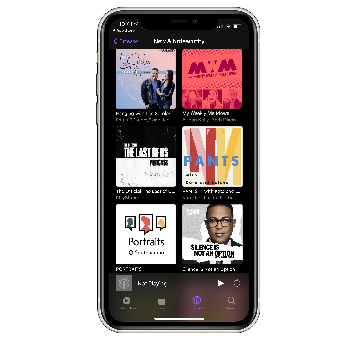
Apple Podcasts lsiting
Swag, because everyone loves swag

